A coworker once told me, “The worst thing about clickbait is that you know it’s clickbait, but you purposely click on it anyways!” In a way, clickbait is kind of like a good CTA. It catches web users’ attentions, and gets them to do something.
So what is a CTA?
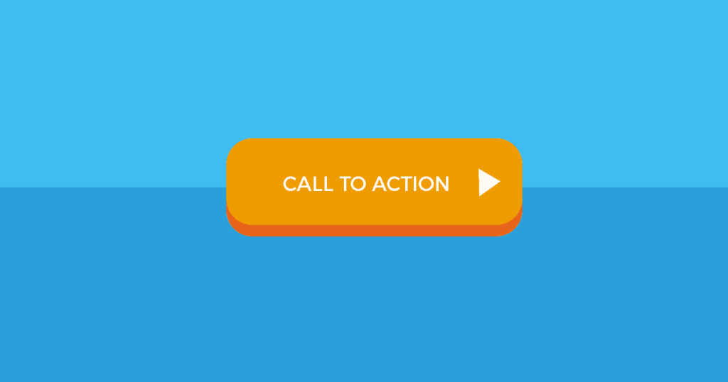
A CTA is a Call to Action, or an element of a website that calls on website users to complete an action. CTAs come in many forms, such as “subscribe here!” text boxes or “download now” buttons. They are important because they turn site users from visitors into engagements, which creates conversions.
Where can I find CTAs?
Since the point of a CTA is to make a user go somewhere or do something, common places include high traffic areas and pages on a site that are relevant to a CTA.
For instance, if you have a newsletter you’d like site visitors to sign up for, you’d want lots of people to see the CTA for subscribing to the newsletter, and so an ideal place for lots of visual exposure is the website homepage.
On the other hand, if you have a CTA that relates to a specific topic, instead of blasting it out onto the homepage, it could be better to do a targeted promotion. For instance, if you’re a marketing agency and one of your services is social media, maybe you have a template for social media campaigns. Since a conversion might be having users download that template, you might include a “download our free template now” CTA, and an ideal place for lots of relevant exposure would be on your “Social Media” webpage, as opposed to your homepage.
How can I make a CTA?
CTAs needs to be compelling to work, so you want to display things that grab attention (usually things that are identified as being interesting or helpful to a user) and tell a web user what to do. CTAs should offer clear commands and directions, such as “sign up now” or “get your quote today” buttons, which tell a site user what to do (sign up, or get a quote), and how to do it (clicking the button).
As a bonus, it’s ideal to create CTAs that can be tracked, such as number of subscriptions, number of users clicking a CTA, or number of emails being collected from a “subscribe now” button. This will help you measure the success of your CTA, and set you up for A/B testing (ie: if you change the wording of a CTA will it gets more clicks; if you put the CTA on the top of the homepage vs the right side does the number of clicks change?).
Real World CTAs
As a web design and development agency, creating relevant and compelling CTAs for our clients is an important aspect of our work. When we design CTAs, we keep a few things in mind.
Location, location, location. Where does it best fit?
Look at the layout of a webpage, and think about what you want a site user to do. Do you want them to start their journey with an action, such as “start my free trial”? If so, put the CTA somewhere big and in full view, like the middle of a homepage. Do you want users to get in touch with you? If so, add a “Chat now!” button, and put it in the bottom right-hand side of a webpage (site users are primed to look here for chat boxes (think, like facebook messenger), so this is a pretty handy spot).
After choosing a location, decide if you want to leverage and to make it dynamic, like a CTA that scrolls with a user as they navigate up and down a page. Decide if you’d like to animate a CTA, having it slide in or pop up after a user lands on a page, of if you’d like to have one that wiggles a bit to catch users’ attentions if they’ve been on a page for a while, but haven’t clicked around.
Choose a CTA color that will contrast with other text or prevalent colors on a website, but stay true to brand image. This often involves a style guide, or a document with specifications on how a company can be represented – from brand personality, to color and font guidelines that must be followed. Find a color from your style guide that pops out from the rest of your website content, but is still part of a brand. This will strengthen your CTA, while staying true to the overall website tone.
Often CTAs feature images in the background. When picking an image, make sure the subject matches your CTA. This applies to not just facial expressions and what subjects are doing, but to their outfit choices and environments too. For instance, if your CTA is for a free health consultation, do you want to feature only fit, young, smiling, people or would it benefit your brand to show variety in age, body types, and emotions so that potential leads can relate? The answer to this will differ depending on which companies you ask.
When writing CTA copy, keep things simple and easy to follow. CTAs should provide an indicator of what a site user should do, and contain action words such as “download”, “subscribe”, “get started”, “watch the video”, and so on. These action words prime site users to know what they should be doing, and how to do it – by clicking a CTA. CTAs also often include words indicating freebies, relatable actions, and a sense of urgency.
Freebie CTAs zero in on the idea that people love free things. Think of services from Mailchimp, Lynda.com, or Amazon Prime. They all offer a free service (even if only for a month), which can make this type of CTA pretty compelling.
Relatability CTAs appeal to the “I want to be included” nature of site users, and often use words like “join” or “community”. This CTA is often used to get site users to subscribe or sign up for something.
Urgency CTAs work by creating a time-pressing sense of immediate need. They have words like “limited”, “today”, or “ends” in them, and they prey on anxiety. These CTAs are often driven by inventory or time, and they prompt users to act now and be more impulsive.
In Summary
There are many types of CTAs you can choose, and many different ways you can implement them. Creating a CTA is deceptively difficult, but is something that you can refine as you iterate. Take the time to create a solid CTA though experimenting with location, design, and copy, and continuously improve through experience and A/B testing.
___
This piece originally appeared on the Isovera blog. Learn more about implementing a strong CTA, here.